The holiday season is finally here, which means I’m stocking up on mailing supplies and rereading the USPS shipping requirements for holiday mail. I think these British mail posters are perfect for this time of year, I found them through the British Postal Museum and Archive on Flickr. The one on the left makes me smile in particular, because twine wrapped packages are pretty much a relic here in the US. The poster on the left is from 1937, and was used to suggest good mailing practices for British post. The poster on the right is from 1957, and I love how it seems to mirror the other illustration, despite being designed twenty years later. Wouldn’t it be cool to see more artist commissioned posters for US Mail?
Inspiration
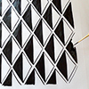
Print of the Week – Serigraphs by Corita Kent

As we enter the holiday season, I think it’s a fitting time to share the work of one of my favorite artists and printmakers, Corita Kent. Kent was a key figure in establishing screenprinting, or serigraphy, as a fine art medium during the 60’s and 70’s. Kent’s work is filled with messages of peace and love, and reflects her commitment to social justice. I find her work to be very moving, and the messages behind her work are as relevant today as they were 50 years ago.

One of my favorite prints of hers is the above left image, which features the quote: “But there is only one thing that has power completely, and that is love.”

In case you’re curious, Printeresting talked about Corita Kent in 2008, and it’s still worth the read.

Gift for your boyfriend / husband / partner / man-friend

Paper Pastries Guest Blogging

Just wanted to share this guest blog post I did for Paper Pastries, in case you want to see more of my vintage postcard collection! Margaret’s blog is great for anyone who loves snail mail, so check it out.
Snail Mail Saturday – Vintage Postage Stamps

I love postage, both contemporary and vintage, but there is something about the bold colors and beautiful design of these vintage stamps that just can’t be matched by modern stamps. I found these particular stamps on Northbank, where they talk a little about the beauty of vintage postage.

I’ve posted about vintage stamps before, here and here, in case you’d like to read more
Print of the Week – David Hockney (part 2)

I’m currently loving David Hockney’s “Portrait of Mother III,” the simplicity of line and color fascinates me. This print is a lithograph; keep in mind that each color is printed from a separate drawing, and has to be meticulously lined up on the press to make sure it overlaps in all the right places. I’ve featured Hockney’s work for Print of the Week before, in case you want to see another excellent print of his.